9 Hallway Paint Colors for Brightening Dim Hallways
Hallways are some of the busiest spaces in a home, and some of the most design-neglected. Because hallways are pass-throughs to rooms where we linger for activities like socializing, eating, or working, they are usually afterthoughts when it comes to thoughtful design. But that’s changing. “Hallways are becoming gallery spaces rather than the transitional spaces they were in the past,” says Amy Wax, international color specialist and color expert at AmyWax.com. And hallways aren’t just white anymore, either.
“I’m seeing more people stop playing it safe in hallways,” says Maria Gerardino, Kitchen Design Lead at Novalina. “Instead of trying to make them disappear, they’re leaning into them. It’s less about keeping things light and more about giving the space some identity.”
Kim Lewis, founder and creative director at Kim Lewis Designs, agrees: “We’re seeing a strong shift toward rich, moody tones that create something unexpected. Colors like Sommelier, Polished Mahogany, Secret Garden, and Still Water by Sherwin-Williams are all having a moment,” says Lewis. “They add a sense of quiet drama and richness that works especially well in hallways. Consider your hallway the next best moment to go bold, like we so freely do in powder baths!”
Whether you lean toward warm whites, rich blues, or luminous pinks, there’s definitely an art to choosing just the right shade for a zone that can feel dim and confined. Ahead, learn how professional color experts and interior designers use paint to transform a ho-hum corridor.
How Paint LRV Affects Brightness
If your goal is to brighten a dim hallway, there’s an easy way to compare paint colors. Check the color’s Light Reflectance Value (LRV). “A good guide for any homeowner to use is to look for the LRV of a paint color,” says Wax. “The lower the number, the less light reflected from the paint color you have selected, the higher the number to more light that is reflected from the color. If you are looking to add brightness to a hallway, carefully select a paint color with a higher LRV to add more light to your dimly lit hallway!”
Paint companies usually list the LRV for each paint color, so it’s easy to compare your favorites. “For homeowners, the key takeaway is this: A warm white paint like Sherwin-Williams Alabaster (LRV 82) or Benjamin Moore White Dove (LRV 83) will be much more effective at brightening a space than a medium-toned beige or gray (LRV 50),” says Kate Smith, color expert at Sensational Color.

Which paint finish should you use in a hallway?
Paint finish can change the way a paint color looks and how it performs over time. “Hallways get used a lot, so the paint needs to hold up,” says Tasha Frie, interior designer with Sims Exteriors & Remodeling Inc. in Stoughton, Wisconsin. “Glossy finishes show every scuff once light hits them. Eggshell sits in a better spot and is easier to deal with over time.”
Gerardino agrees. “I avoid anything too flat because it can make the walls feel heavy, almost like they’re absorbing everything,” she explains. “I also stay away from anything too shiny. That tends to exaggerate surface issues. A low-luster finish works better. It keeps the surface readable without drawing attention to it.”
Because design choices aren’t one-size-fits-all, however, there are times when a flat finish can be a good choice. “A flat finish on the walls and ceilings is our go to,” says Lewis. “If you have high traffic, kids, consider a washable flat.” She suggests the new washable flat finish from Sherwin-Williams. “If you are doing more of a commercial space or have young kids or dogs, consider an eggshell. But our preference is flat, so you have the least sheen possible.”
What about lighting?
Color and light work together to create the overall feeling in a space, and the type of lighting can change how color looks, too. It’s essential to think through your lighting plan and types of fixtures and light bulbs when designing a dim hallway. “What is often overlooked is how lighting can make a world of difference in a dim hallway,” says Wax.
“Paint helps, but lighting does more,” says Frie. “I worked on an entry hallway that still felt dim after repainting. We added a small lamp on a console and a wall light above it. That changed how the space felt right away. Even one extra light source can make a difference.”
However, you’ll achieve more from your design if you can strategize light from more than just one fixture. “Most entryways rely too much on a single overhead light, and it rarely spreads far enough. That’s usually the issue,” says Gerardino. “I prefer using more than one source, placed at different heights. A wall light closer to eye level or even a floor lamp can shift how the space feels. I’ve also had good results painting the ceiling slightly lighter than the walls to help bounce what little light there is.”
“Good lighting is essential,” Lewis agrees. “If you have a dark entryway and want it to be brighter, always start with lighting. Think of your lighting in layers, balancing overhead and ambient. Consider wall sconces, LED cove lighting, a flush mount overhead and a table lamp. Table lamps in the entry create an immediate welcoming and home spirit.”
“If you have the width, add lighting on both sides of the hallway to make the room feel not only brighter but wider too,” says Wax. “Done well, new lighting can be a win-win to brighten and give the feeling of more space in the room.”
1. Warm White

White is often a go-to when it comes to dark hallway paint ideas, but designers look for softer and warmer whites that can be more soothing without compromising on the LRV. “I do not use bright white in dark hallways,” says Frie. “It sounds like the safe option, but it usually falls flat once it is on the wall. There is no light to carry it. Softer colors work better. I worked on a hallway with no windows where we switched from a crisp white to a warmer tone, and it immediately felt less dull.”
Kate Smith’s picks: Soft, warm whites, such as Benjamin Moore’s White Dove, Swiss Coffee and Steam, or Sherwin-Williams’ Alabaster and Pure White, create an open feeling by maximizing available light.
Amy Wax’s pick: Benjamin Moore’s Onyx White is a creamy white with just enough color to contrast with trim.
2. Soft Beige

If whites feel too harsh but you still want to keep the hallway subtle with a hint of color, then consider a warm, soft beige or greige. “Cool gray is fading out and warmer tones are taking over,” says Frie. “Greige, soft beige, and quieter colors show up more now. I am also seeing people move away from plain neutrals and bring in a bit of color, but it stays soft, nothing too strong.”
Kate Smith’s pick: Benjamin Moore’s Pale Oak is a neutral that offers grey undertones.
3. Warm Gray

Gray has been very popular with the Millennial generation, and while its time in the spotlight has faded a bit, warmer greys are still popular. “The palette for hallways right now leans warm, earthy, and grounded—a deliberate departure from the cool-gray era,” says Smith. While a warm gray is a subtle neutral, it adds some quiet personality to a dim hallway, but without the hint of yellow that warm beiges exude.
Amy Wax’s pick: Sherwin-Williams Rhinestone is a light gray that is airy and light.
Kate Smith’s picks: Warm neutrals like Sherwin-Williams’ Agreeable Gray and Drift of Mist, as well as Benjamin Moore’s Balboa Mist, add a subtle warmth that feels welcoming.
4. Quiet Blue

Blue is well-known as America’s favorite color, and it’s usually in the mix when selecting paint for many types of spaces. When it comes to a dark hallway, a quiet blue that can act a little bit like a spunky neutral can make it feel a bit more expansive, like looking out at the vast sky on a clear day. “We always like to go light and bright for a dim hallway and add in pops of color,” says Zoe Grant, interior designer with DBD Lifestyle. “A hallway can be a major statement moment but it’s not one we personally like to make dark.”
Amy Wax’s pick: Sherwin-Williams Blue Horizon is a cool gray with the slightest hint of blue.
Zoe Grant’s pick: Sherwin-Williams Upward is a soft denim blue that has grey undertones.
5. Delicate Green

As the biophilic trend has captivated interior design, some greens have emerged as another popular neutral in homes. Usually a bit muted with gray undertones or a delicate soft green, adding these greens to a hallway that’s light-challenged can help create a soothing and calming feeling that makes a small space feel more welcoming.
Kate Smith’s pick: Muted greens, such as Sherwin-Williams’ Evergreen Fog or Benjamin Moore’s Soft Fern, offer a calming touch.
Amy Wax’s pick: Sherwin-Williams Sprout is a delicate green with a noticeable freshness to it.
6. Creamy Yellow

Lifting a dim hallway out of the gloom can be a challenge, so you may want to go full cheer with a creamy yellow for your narrow hallway color ideas. Instead of a bright yellow that can be overwhelming in a small space, a creamy yellow offers a subtle color that’s most associated with happy vibes.
Amy Wax’s pick: Benjamin Moore’s Aura is creamy light yellow that has an LRV of 77.46.
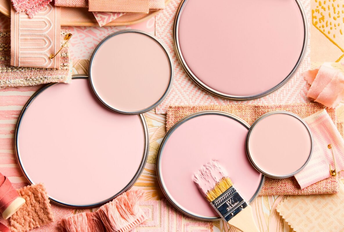
7. Luminous Pink

Pink might sound like an odd pick outside of a kid’s bedroom or Barbie’s dream house, but there are a wide variety of pinks and they are a worthy consideration among hallway paint ideas. For example, a gentle luminous pink is like a step beyond beige. There’s a hint of pink but it’s not far from its beige cousins. It acts as a neutral and can pair well with white or wood trim.
Amy’s pick: Benjamin Moore’s Aphrodite Pink is a luminous coral color that’s elegant.
8. Rich Blue

It might sound odd to go with a dark paint color in a dim space, but “sometimes embracing what you have and leaning into it is the right answer,” says Lewis. “If a space is destined to be dark, own that and exaggerate the emotion of the area by making thoughtful selections that push the mood further.”
Colleen Bennett, founder and lead designer of CBB Design Firm agrees: “Hallway colors that are trending are either really dark ones like with deep browns, deep purples, and deep greens that look really beautiful or going super bright white.” So really, the best hallway paint color for your home is often a very personal choice.
Kim Lewis’s pick: Still Water by Sherwin-Williams is a dark blue that’s moody and calm.
9. Color Drenching

Painting the entire hallway—walls, trim, ceiling—the same color is a color drenching technique that can actually make the space feel more special. “Color drenching works anywhere. You just have to have sufficient lighting,” says Kim Lewis. “I actually love popping the same wall color to the ceiling in a hallway, as it makes that space feel like its own room—not just a passage to another one. The hallway becomes experiential and cocoon-like.”
Smith suggests: “Embrace the darkness instead of resisting it. Choose a color with warmth or richness, and opt for satin or eggshell paint finish.” But Bennett has another point of view about color drenching a dim hallway: “If I was going to do that, I would do it all white.”
What about wallpaper?

Wallpaper is another design tool that can add drama and dimension to a dim hallway. “Wallpaper sets a tone, and that can play well anywhere,” says Lewis. But the scale of the wallpaper pattern and the finish of the wallpaper need to be considered.
“Wallpaper can be a great choice for a dark hallway, but it’s best to choose lighter backgrounds, smaller or more open patterns, and finishes with a slight sheen,” says Smith. “Lighter and airy patterns, such as soft botanicals, subtle geometrics, or lightly textured options like linen weaves, can add both pattern and texture without making the hallway feel darker.”

The Homeowner Survival Kit